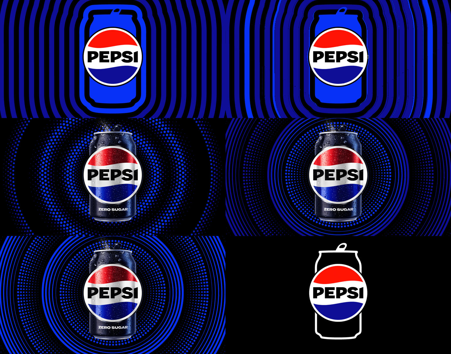
Episode 50: The Pepsi (Logo) Challenge
Pepsi announced it’s moving forward by moving backwards (sort of), returning to more of a traditional look for their logo and cans. (Think black. It's a slimming color.) But as they kick their last logo to the curb, we go back in time to discuss how they became saddled with this burdensome brand look in the first place. We talk ovals, smiles, globes, magnetic fields and cosmic forces of the universe in this special breathtaking and scientifically-tangential episode.
E X T R A S :
(Top to bottom): The new Pepsi logo in all its animated glory, the Pepsi logo from 1973 that bears a striking resemblance to its younger sibling, the “smile” mark designed by the Arnell Group and introduced in 2008
The ill-fated Tropicana orange juice redesign
The Pepsi Challenge (YouTube Video)
The “Breathtaking Design Strategy” document (PDF file)
Additional articles on the logo redesign:
The Drum
Fast Company
GDUSA
Adweek
More background on the Tropicana debacle here.
Tropicana’s 2024 brand refresh (Fast Company article)
The saga of New Coke, told by Coca-Cola themselves.


